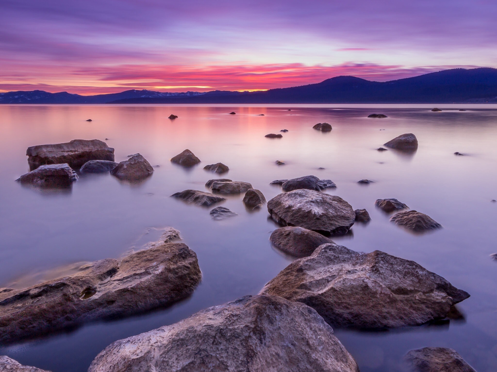
Photo Challenge Element of Composition: Depth
A photograph with a sense of depth invites the viewer to explore an image. Depth creates a backstory for an image, and it adds dimensionality and richness. Learning how to emphasize depth is a important skill for every photographer.
What is Depth in Photography
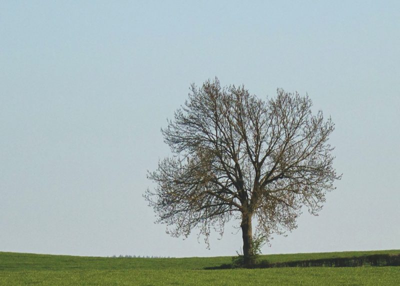
Depth is the feeling of three-dimensionality you get from looking at an image, the sense that you could walk into an image and there would be something to explore. Depth exists on a spectrum — an image can have no depth, or a large amount of depth, or anything in-between. This is an example of an image with very little depth.
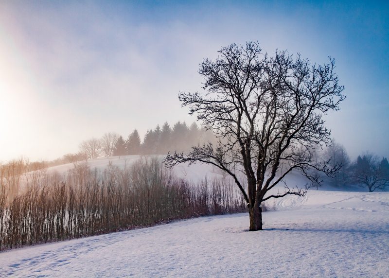
And this is a similar image with a larger sense of depth.
How to Emphasize Depth in Photography
There are many strategies for emphasizing depth, provided the subject and location you are photographing in actually has depth. You can use any of the following strategies – or several of them in the same image – to enhance depth.
- Plan your photograph so that there is a foreground, mid-ground, and background.
The three layers create a sense of depth. A wide angle lens allows you to capture more of a scene and thus gives you more opportunity to include a foreground, mid-ground, and background.
The image below has a wonderful foreground of driftwood, the pond as the mid-ground, and the mountains as the background. There are two layers of mountains too, the ones just behind the pond and the ones in the misty distance.
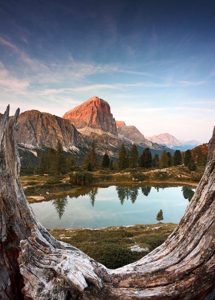
Experiment with your point of view – a worm’s eye view often creates interesting distortions of elements in the foreground.
Of course, even two layers will create a sense of depth, but the more layers, the greater the sense of depth.
2. Frame your subject.
If you frame your subject with something in the foreground, it can give your image a sense of depth as well as provide more meaning for the image. You can use tree branches and shrubs, windows, etc…
Using framing in combination with a shallow depth of field as in the image below can be extremely effective. The foreground frame of leaves is blurred, and the subject is sharp, further differentiating the layers.
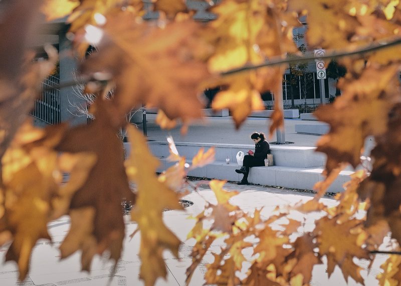
3. Use a shallow depth of field.
By photographing your subject with a low f-stop, you will separate your subject from the background as the background blurs away. The image below has foreground that is a little bit blurry, the dog, and then the background where the flowers get progressively more blurry heading towards the trees.

You have to be careful not to wipe out everything in the background into a flat painting if you are trying to maximize depth. The image below emphasizes the dog more than the image above, but it has less depth because everything in the background is uniformly blurred out, like a painting or a backdrop.

4. Use a curved leading line to draw the viewer’s eye through the image.
This is especially effective in landscape compositions. A curved line working its way through the image connects the foreground, Midground, and background. A curved line also slows the viewer down in your image, and subconsciously that implies more depth to the scene because it is taking the eye longer to traverse it.
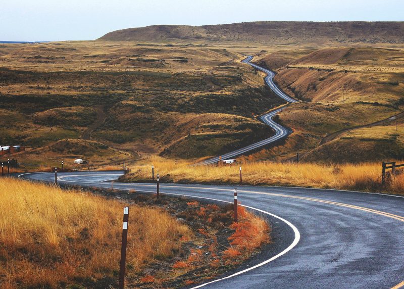
5. Use converging lines that meet at the horizon.
This perspective creates a sense of distance and depth. You can change your point of view to emphasize them.
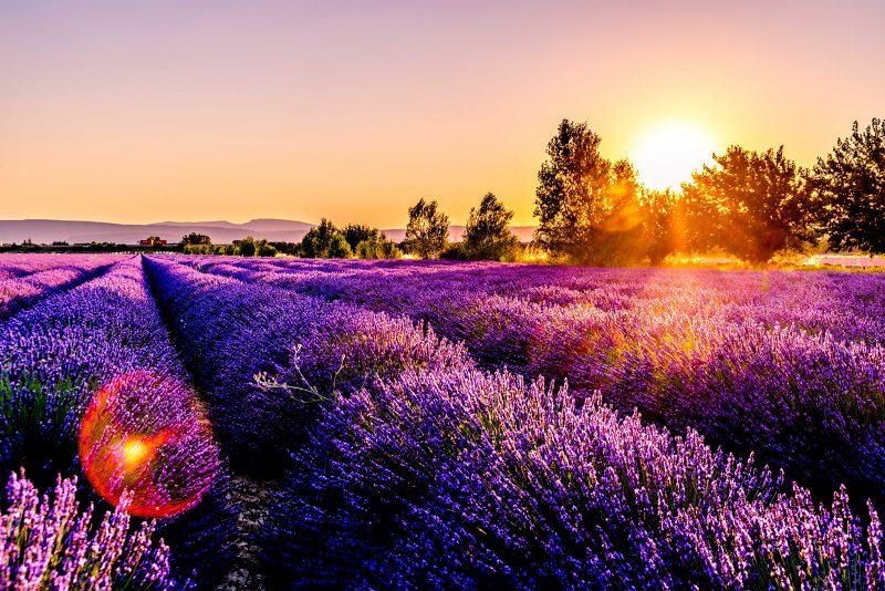
6. Emphasize patterns getting smaller.
Cars parked on a street, seats in an arena, pillars in front of a building – as these things get smaller moving into the image, that conveys to the viewer that those elements are further away, creating a sense of depth. In the image below, we know the balloons are roughly the same size, so we know the ones that appear smaller are further away, enhancing our sense of depth.
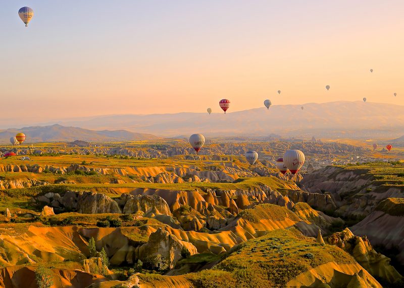
Again the worm’s eye view is very powerful for distorting the elements in the foreground of the image and making them appear larger.
7. Use light to emphasize one layer of the photograph.
This is related to the first point of having layers, but if light is shining on just one of the layers, it really helps to separate them and emphasize depth. In the image below, the sunbeam is hitting the mid-ground, emphasizing it and separating it from the foreground and background.
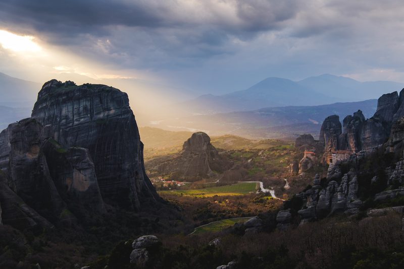
Lack of light on a layer can have the same effect, like the haze in the background of the balloon image in tip 6 tells us that it is farther away than the foreground, where the light is creating dramatic shadows.
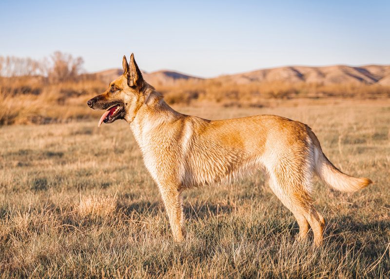
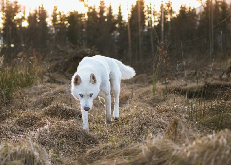
8. Use contrasting color to help an image pop separate from the background.
The following images illustrate this. If the subject blends in with the background, there is less depth perception. When the subject is contrasted with the background, there is more depth perception.
#MindfulPhotoChallenge: Incorporate Depth Into Your Image
Use any of the above strategies to create an image with depth.
Share your images on Instagram with #mindfulphotochallenge and/or #RefocusPhotoChallenge, and tag me @ goodhartphotography.
If you enjoyed this article, you might like:
- My full color 30-Day Photography Challenge Workbook here on Amazon.
- My Photography Articles Listed and Sorted by Type here
- My Mindful Photography Workshop here
- My “A Gossamer Thread” Newsletter about photography/creativity, productivity, and joy here
Photo credits: Alessio-furlan, Daniela-cuevas, dulces-lima, Jeffrey-grospe, Jesse-bowser, John-mark-arnold, Leonard-cotte, marek-szturc, pedro-sanz, rodrigo-soares, vincent-van-zalinge, vangelis-batsikostas
